Making themes
A theme is one CSS file dropped into the workspace — no build step, no fork, nothing executable. This page is for theme authors: what you can customize, the rules your CSS must follow, and how to install and share the result.
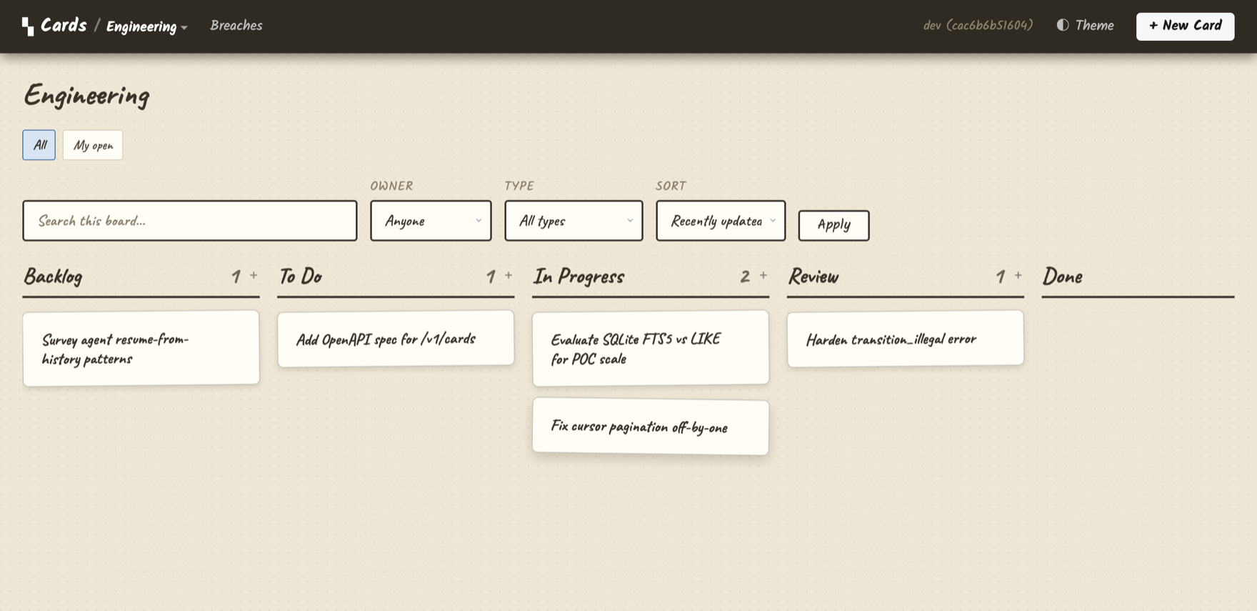 The demo board under the
 journal theme. Every difference here — palette,
type, card chrome — is one scoped CSS file.
What a theme is
Two files in definitions/themes/:
definitions/themes/
  my-theme.css     # every rule scoped to html[data-theme="my-theme"]
  my-theme.json    # optional manifest: name, fonts, description
The server appends workspace theme CSS after the base stylesheet, and the
theme applies when html[data-theme="my-theme"] is set. The base UI is
complete on its own — a theme is pure override, and deleting every theme file
leaves a working UI.
html[data-theme="my-theme"] {
  --c-accent: #1c7ed6;
  --c-flat: #dbeafe;
  --c-surface: #f2f8fd;
  --type-task: #1c7ed6;
}
html[data-theme="my-theme"] .card { border-radius: 10px; }
html[data-theme="my-theme"] .app-nav {
  background: linear-gradient(90deg, #0b4a86, #1c7ed6);
}
{
  "name": "my-theme",
  "contract": 1,
  "description": "Cool blues, soft surfaces.",
  "fonts": "https://fonts.googleapis.com/css2?family=Sono:wght@200;400;600&display=swap"
}
What you can customize
Themes work by overriding design tokens (CSS custom properties) and by styling stable hooks (documented classes and data attributes). In practice that covers:
- Palette —
--c-*tokens: surfaces, ink, borders, accent, nav colors, plus per-card-type colors (--type-<id>/--type-<id>-bg). - Typography — the
--role-*tokens: card titles, detail titles, field labels, metadata, body text. Each role sets size/weight once and every element sharing the role follows, so a theme can re-tune the whole hierarchy from one block. Fonts come via the manifest'sfontsURL. - Component chrome — scoped rules on the stable hooks: board and lanes
(
.board,.lane,.lane__head), cards (.card[data-type],.card__title,.card__meta, chips and stats), the detail/modal anatomy (.modal__head,.field,.entry, comment feeds), forms and buttons. - Type identity — cards carry
[data-type="<id>"]and[data-icon]attributes; icons are monochrome CSS masks (card,star,bug,check,flask,target,code,pen,wrench) you can recolor freely. - Modal geometry —
--modal-width/height/ratiopresets. - States — drag (
.is-dragging,.is-drag-over), upload states (.artifact-upload[data-state=…]), validation (.is-invalid), focus.
The full token list and role system are documented in the design system; the complete hook catalog (every class and attribute a theme may target, by surface) is in the theme contract.
The rules
Themes are validated at load; a file that breaks the rules is rejected with a structured error naming the file, line, and rule — and the rest of the workspace keeps serving with the theme simply absent.
- Every rule scoped. Each selector must start
html[data-theme="<name>"](rules inside@media/@supportsincluded). Base CSS never references your theme; your theme never leaks outside its scope. - No
@import, no remoteurl(). Relative anddata:URLs are fine; web fonts go through the manifest'sfontsfield — the one reviewed, explicit place a theme may fetch from. - Braces must balance. An unterminated rule would swallow everything after it, so it's a load error instead.
- CSS only. Markup is never theme-conditional. If a design needs structure that the hooks don't expose, that's a design-system change to propose, not a theme.
An unknown theme name is harmless — data-theme="nope" matches no rules and
renders the default. A stale cookie or an uninstalled shared theme can never
take the UI down.
Selecting a theme
Resolution order, highest first:
?theme=<name>in the URL — sticky via cookie;?theme=defaultclears it.- The visitor's cookie.
board.presentation.theme— assign a theme to one board to try it out.settings.themeinworkspace.json— the workspace default.- Built-in default.
Boards can additionally tweak hue tokens inline via the board's theme map
(e.g. {"--c-accent": "#a8503c"}) — that layers on top of whatever named
theme is active and never carries rules.
Trying your theme
$ cp my-theme.css my-theme.json path/to/workspace/definitions/themes/
$ cards reload                    # or restart; --watch picks it up too
$ open "http://127.0.0.1:8787/ui/boards/welcome?theme=my-theme"
Reload rotates the stylesheet URL, so returning tabs refetch instead of
serving stale CSS. A validation failure comes back as a 422 naming each
violation.
Sharing a theme
Sharing a theme means sharing the two files. Publish them in any repo or
gist; installing is dropping them into definitions/themes/ (by hand,
curl -O, or a git submodule). A git pull of a workspace brings its
themes along. The manifest's "contract": 1 lets the loader warn if a theme
targets a future version of the hook catalog.
Built-in and demo themes
journalandlabelsship in the binary (view with?theme=journal/?theme=labelson any workspace).jeeruhships as a workspace theme inexamples/demo-workspace/definitions/themes/— the best starting point to copy.